Go Delivery
Optimizing restaurant order management for efficiency and scalability
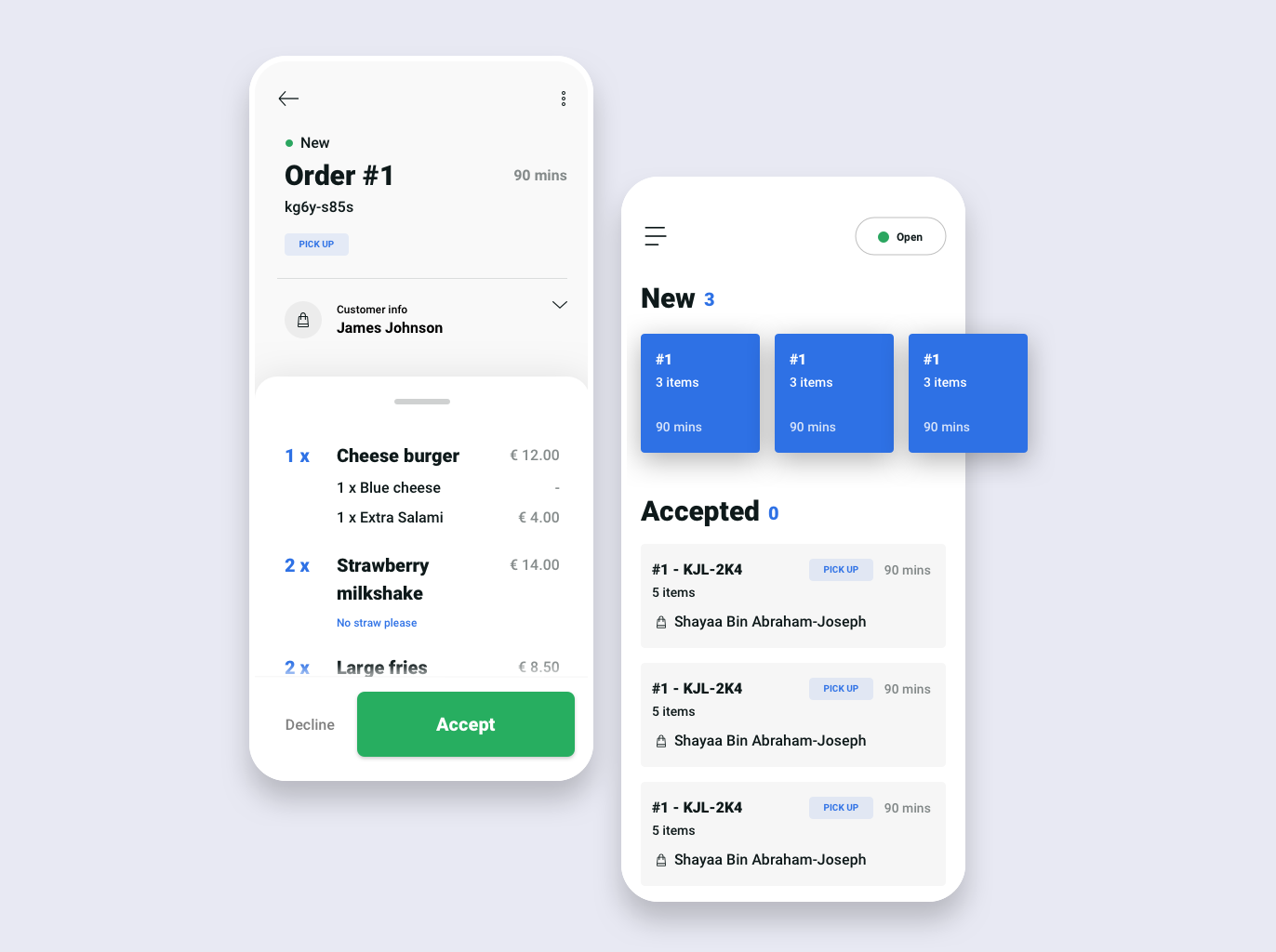
Overview
Go Delivery is an order management platform used by over 500K+ restaurants worldwide. As the platform scaled rapidly, its user interface became cluttered, leading to inefficiencies and a frustrating user experience for restaurant staff.
This redesign focused on simplifying workflows, improving readability, and ensuring consistency across mobile and web platforms. The goal was to create an intuitive system that reduced errors, streamlined order processing, and ultimately enhanced operational efficiency.
The Challenge
Go Delivery's rapid growth led to an increasingly cluttered and inconsistent user experience. The system had been developed in an ad-hoc manner, leading to inefficiencies that affected restaurant staff and operations. Key issues included:
- Overcomplicated UI: Important information was buried under excessive elements, making it difficult to process orders efficiently.
- Lack of Consistency: Mobile and web experiences were disjointed, leading to errors and training difficulties.
- No Scalable Design System: Every new feature required designing from scratch, leading to redundancy and inefficiency.
The challenge was to streamline the order management experience, unify mobile and web designs, and introduce a scalable system that could support future growth without adding unnecessary complexity.
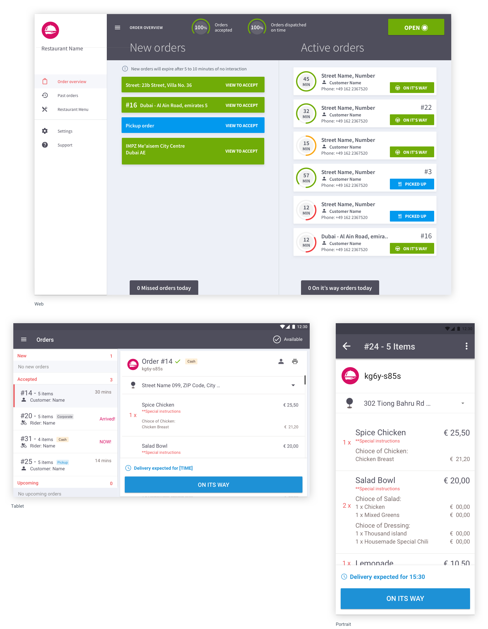
Old UI: Overloaded screens and inconsistent workflows
My Role & Team
As Lead Product Designer, I drove the research and redesign of Go Delivery, working closely with cross-functional teams to ensure a seamless user experience.
- Worked with the Product Manager to define business goals and prioritize features.
- Designed UX workflows, wireframes, and high-fidelity prototypes, ensuring feasibility with developers.
- Led UX research and strategy, including a field study in Malaysia, collaborating with the Design Manager to align on vision.
Through close collaboration and hands-on research, we built a streamlined, scalable design system that improved efficiency for restaurant staff worldwide.
Discovery
Understanding the Existing System
We conducted a deep dive into the current UI to spot pain points and inefficiencies:
- Redundant elements cluttered the interface, making it harder to process orders.
- Mobile and web inconsistencies created confusion and slowed workflows.
- Stakeholder collaboration helped prioritize content and streamline decision-making.
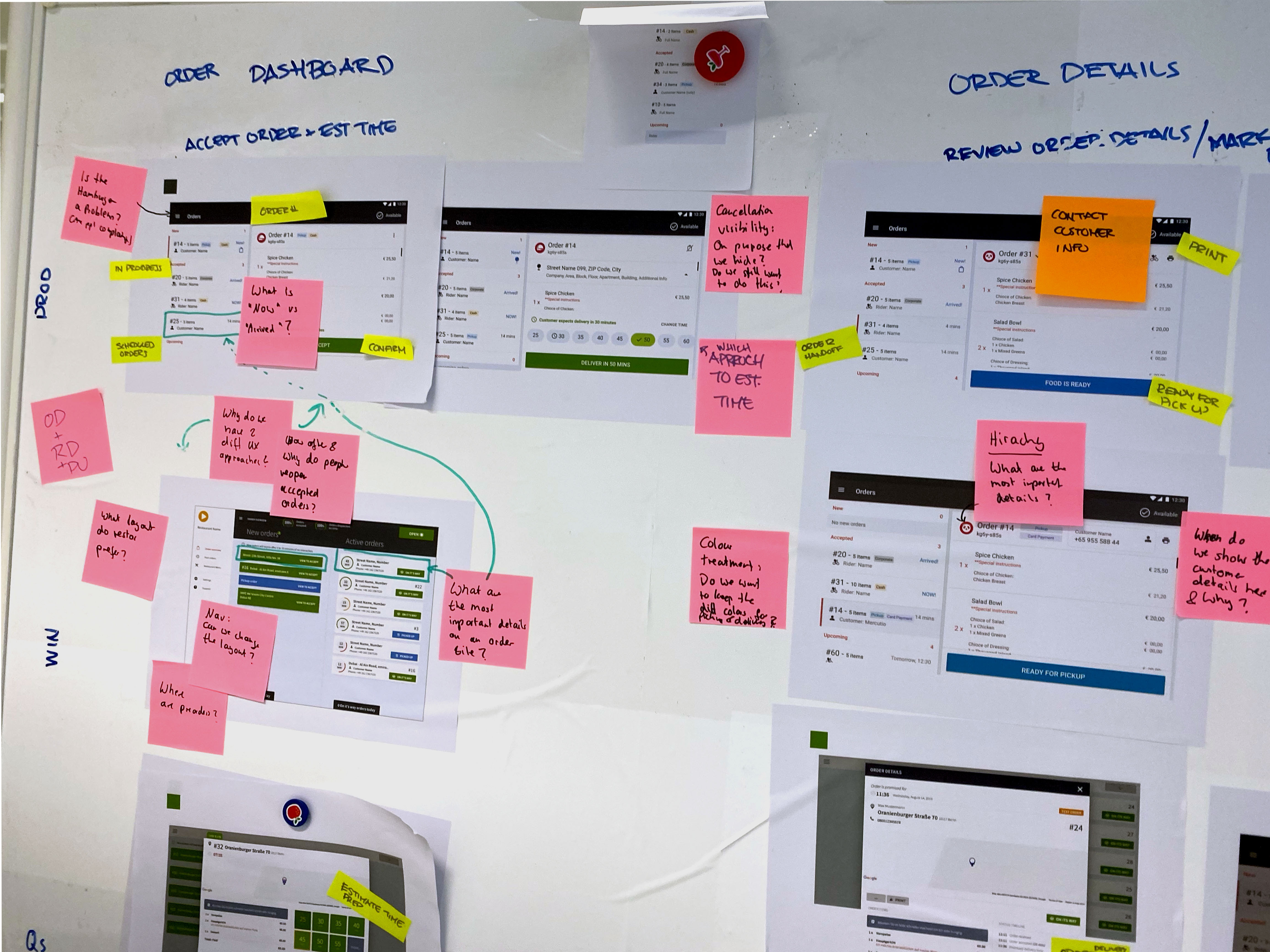
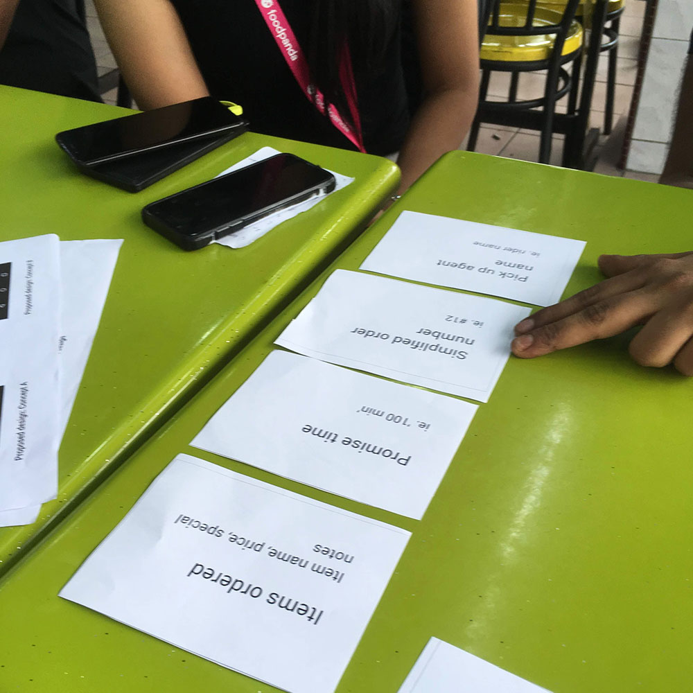
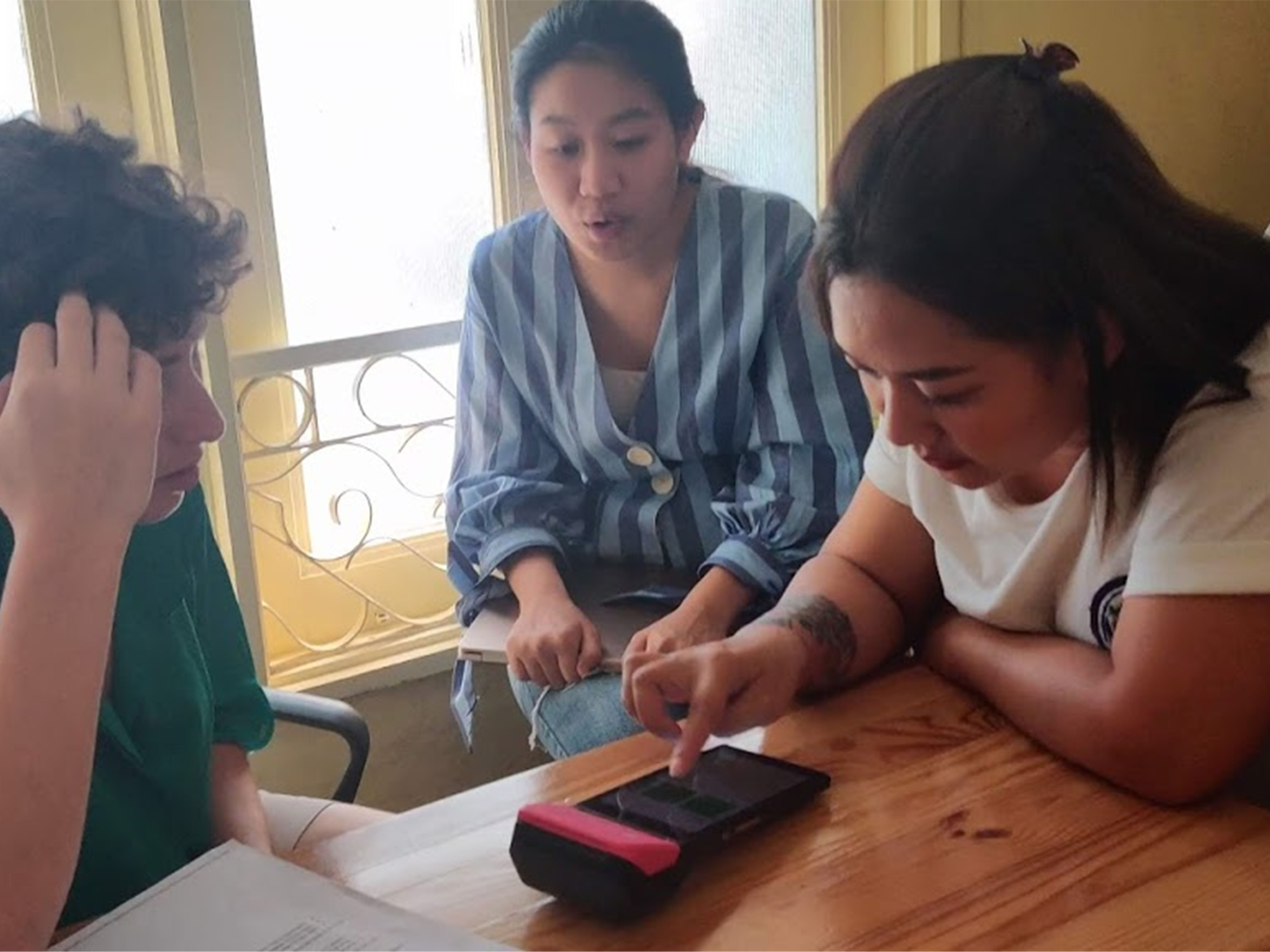
Photo from kick-off session
Ideation & Prototyping
Reimagining the Order Processing Flow
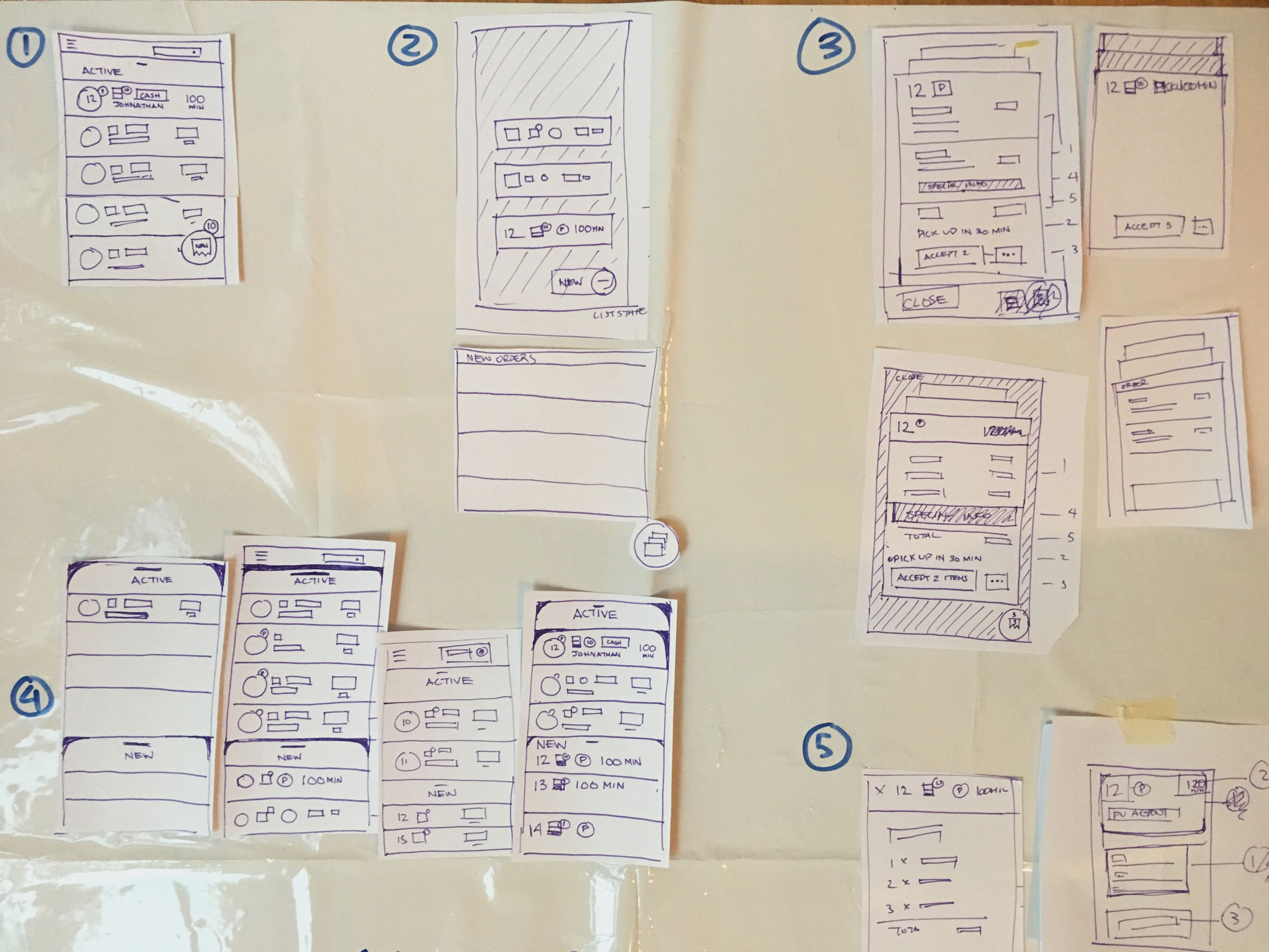
Using our research insights, we explored multiple UI concepts to improve the efficiency of order management. The key design principles focused on:
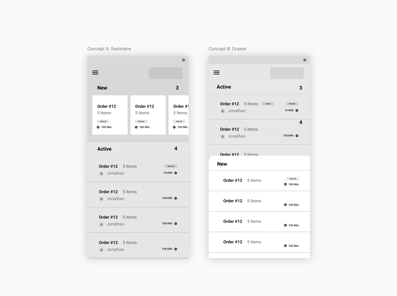
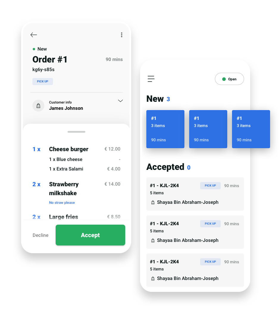
- Creating a swimlane-based order management system for better prioritization.
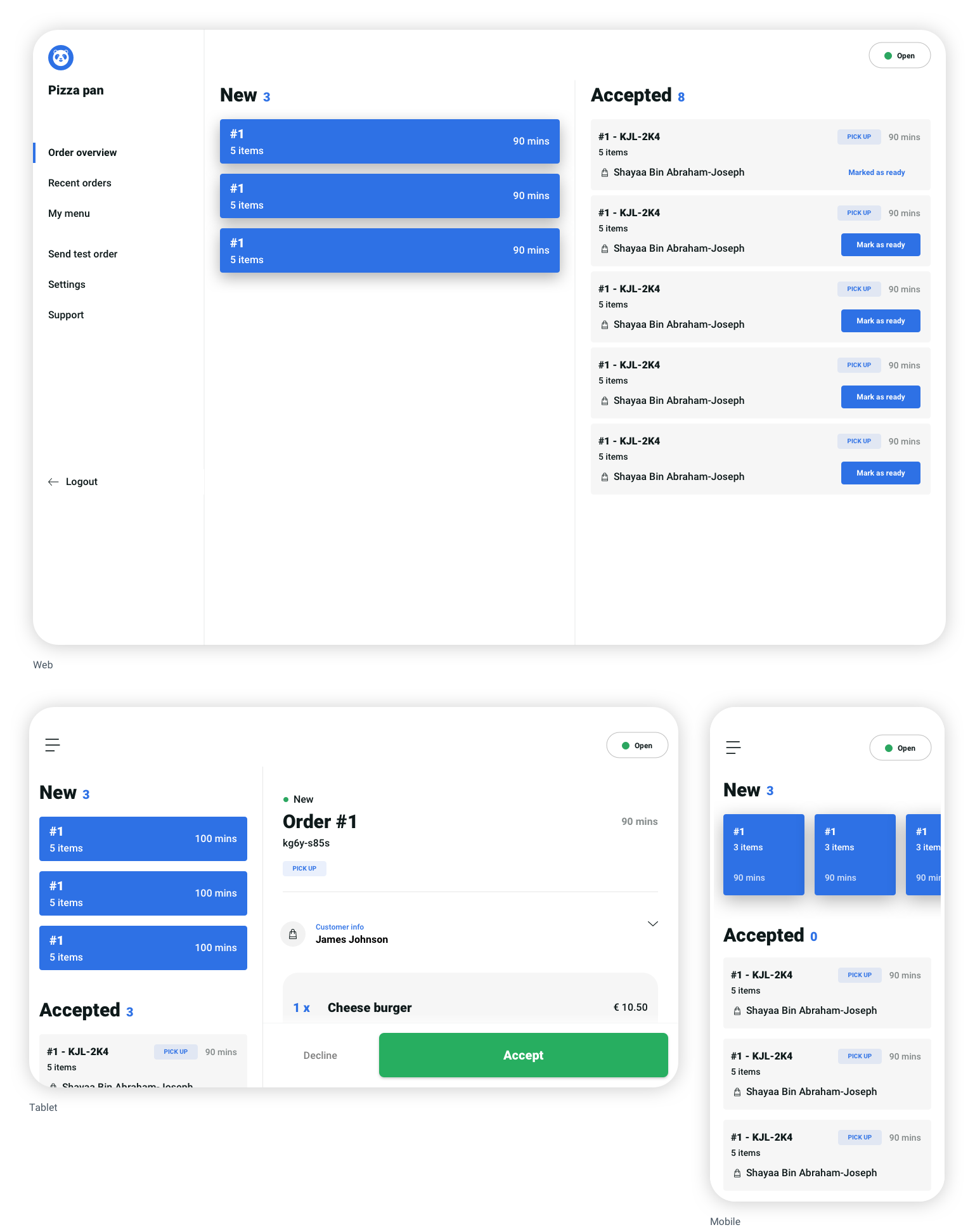
- Unifying the mobile and web experience to minimize discrepancies.
- Prototyping two distinct approaches: Swimlane vs. Drawer Layout.
Field Research & Validation
Testing in Real-World Environments
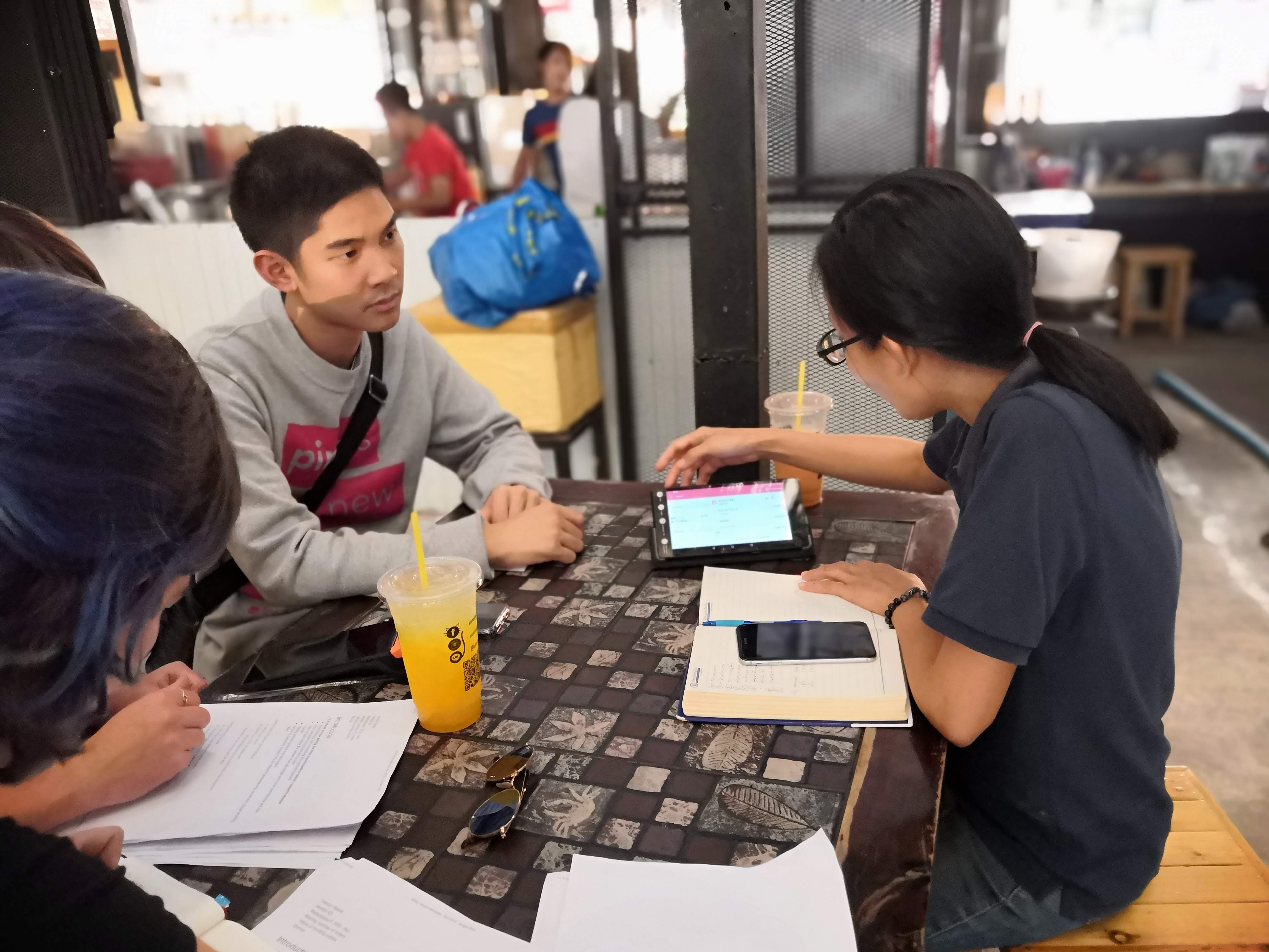
To validate our design decisions, we traveled to Malaysia for in-person research, testing our prototype with restaurant owners and employees across 12 locations, ranging from street food shops to international chains like KFC. Additional job shadowing at a Partner Support Center provided further insight into operational challenges.
Key Feedback from Testing:
- 85% of users preferred the Swimlane interface for its better readability.
- Staff appreciated the bold, dark fonts for improved legibility.
- The need for quick-switching between new and active orders was a recurring request.
Implementation
Final Design Enhancements
- New swimlane concept for mobile: Improved order visibility and prioritization.
- Bold, dark font faces: Enhanced readability for quick decision-making.
- More whitespace: Reduced visual clutter for a cleaner, user-friendly experience.
- Unification of mobile and web: A single, seamless design across all devices.
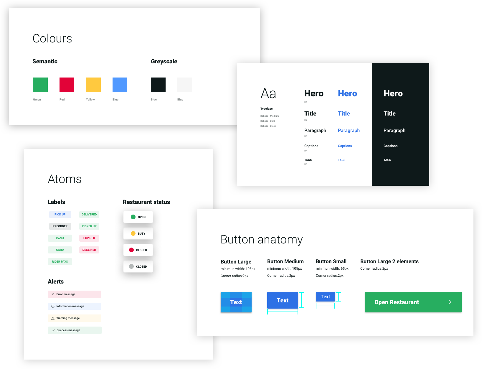
- MVP Design System: An atomic design approach with reusable components for scalability.
These refinements ensured that restaurant staff could process orders faster and with fewer errors, improving operational efficiency.
Impact & Results
The redesigned Go Delivery system significantly improved restaurant operations, leading to measurable efficiency gains:
Key Outcomes:
- 30% reduction in order fulfillment time, improving service speed.
- 25% increase in staff productivity due to a more intuitive interface.
- 90% user satisfaction rate, highlighting strong adoption and approval.
By aligning mobile and web interfaces and creating a scalable, reusable design system, the new Go Delivery platform set a foundation for continued innovation and efficiency in restaurant order management.
Final Design
Testimonials
"The new design has completely transformed how we manage our delivery operations. It's intuitive, efficient, and has significantly reduced our order processing time."
"As a driver, I love how easy it is to navigate and update order status. The real-time updates have made my job much smoother."
"The analytics dashboard has given us valuable insights into our delivery performance. We can now make data-driven decisions to improve our service."
