In-Store Mobile Experience
Digital Wallet for Mobile Coffee App

Overview
Tim Hortons is the largest quick-service restaurant chain in Canada, with 4.9K restaurants in 15 countries worldwide. As a Product Designer on the Ecosystem team, I led the redesign of key mobile experiences, focusing on reimagining the in-store mobile payment flow. The outcome was a modernized interface with enhanced services and features. This case study outlines the UX redesign of 'Scan', the app's most-used feature for mobile payments and rewards.The Challenge
The Problem
Scan is the most-used feature in the Tim Hortons app, allowing customers to make quick payments and earn rewards in-store. As the most used feature in the app, it was critical to improve its efficiency and user experience.
Our goal was to simplify checkout by combining payment and rewards into a single seamless action.
Key Tasks
- Scan once to pay & earn rewards – Eliminate extra scanning steps.
- Centralize payment settings – Make managing payment methods easier.
- Simplify reward management – Combine payment and rewards in one place.
Pain Points
- Two-step scanning process: Users had to scan twice—once for rewards, once for payment—slowing down checkout.
- Dispersed settings: Payment and reward preferences were in separate parts of the app, making them hard to manage.
- Inconsistent UI elements: Various interaction styles (tabs, toggles, text links) increased cognitive load.
The Solution
One Tap to Scan, Pay and Earn
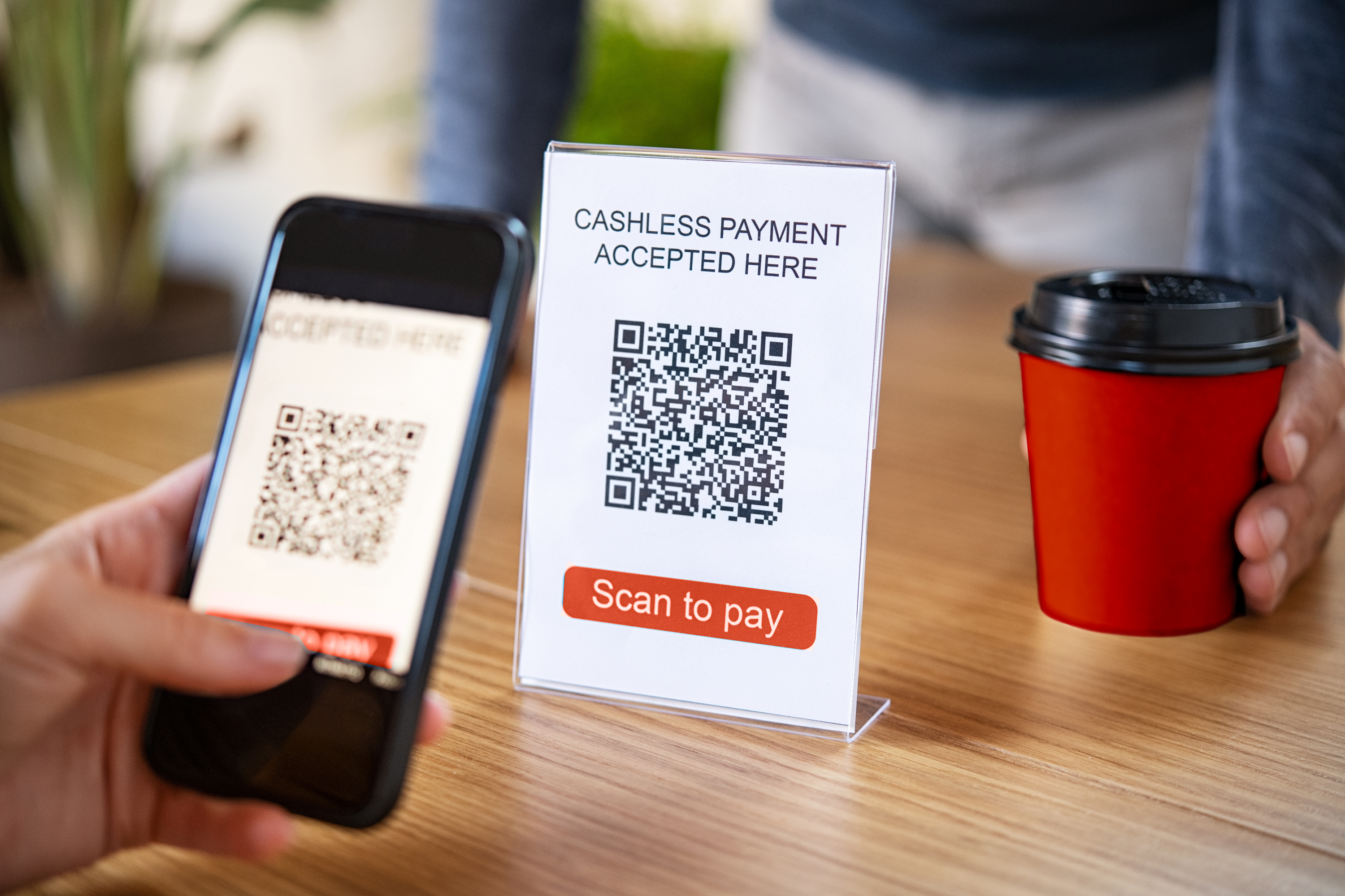
Our research showed that shifting from a customer-presented QR code to a vendor-scanned QR code improved speed and reduced errors.
This updated interaction speeds up the in-store check-out experience and reduces scanning issues related to vendor devices. Scan pay and earn points in one tap.

Example of mobile payment interaction. The customer scans a vendor QR to pay.
All payment settings in one place
Data analytics highlighted a correlation between scanning time and changing reward tiers. Moreover, 160K customers edit rewards levels per day.
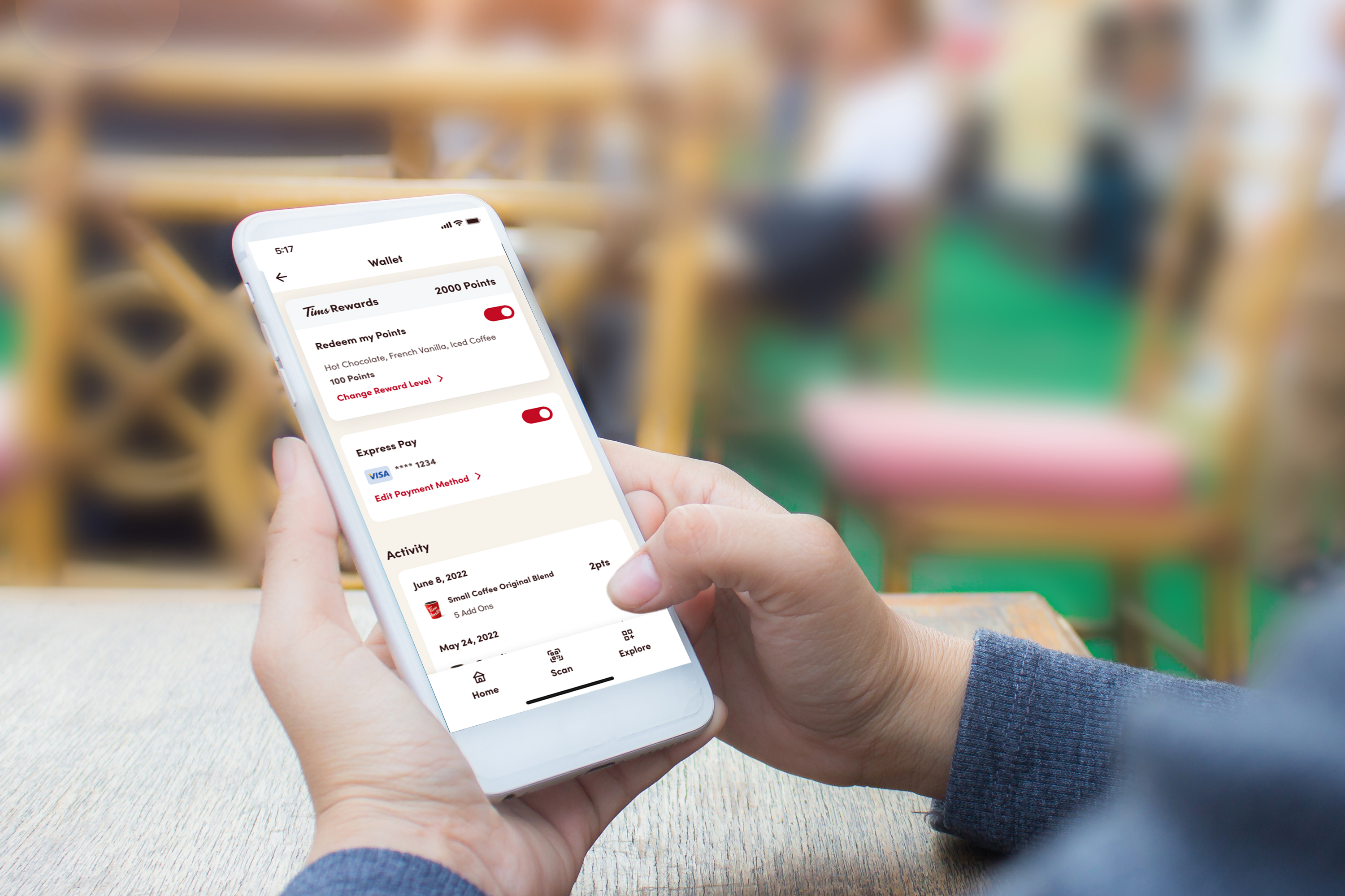
Previously payment-related features were siloed into different areas of the app. The Wallet consolidates all payment-related activities. Customers can easily manage payments, reward settings, and transaction activity all in one place.

Photo of user interacting with app on their mobile device
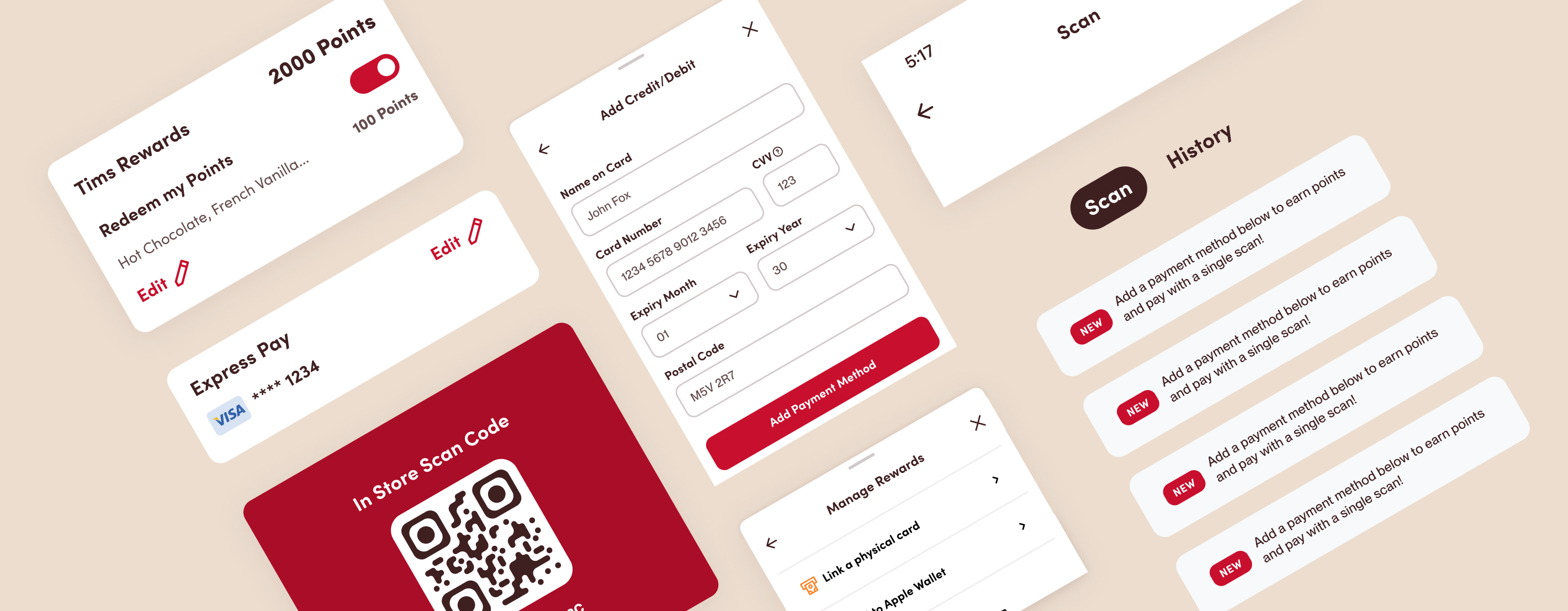
A cleaner interface for a smoother mobile payment experience

Examples of UI component explorations
- Scan the fast action button (FAB) for quick access to Express Pay.
- Updated UI components provide a cleaner interface for editing reward and payment settings.
Final Design
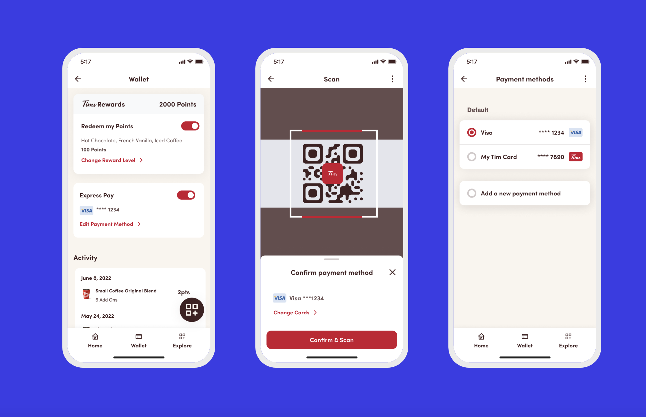
The final design features a streamlined payment process, consolidated settings, and a cleaner interface for mobile payments.

Final design screens showing the new payment flow
Impact
- Faster checkout – Eliminated redundant scans, improving transaction speed.
- Simplified user experience – Centralized all payment and reward settings.
- Cleaner UI – Standardized components for easier interactions.
- Company-wide rollout – Successfully implemented across all Tim Hortons locations.