Redesign of Centre for Free Expression Website
Product Design / UX Research / UI & UX Design
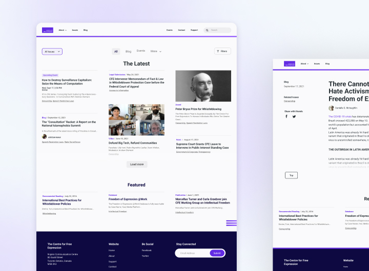
Background
The Centre for Free Expression (CFE) is an organization within Ryerson University that provides information about issues related to free expression in Canada and worldwide. The Centre's website serves as a learning tool where users can explore information and attend events related to free expression. Many resources are used by people who teach and study in this field.
CFE's goal was to present its resources in a more user-friendly way. I created an updated design that was modern, easy to navigate, and scalable to accommodate for future growth.
Discover
Understand the problem + Collect Data (Research)
To kick off the discovery phase, I facilitated a workshop to understand CFE's mission, the website's purpose, and current pain points. The session included the following activities:
- Brand Workshop to learn about the organization and its goals (Value proposition)
- Website Design Audit to identify areas for improvement
- Google Analytics data analysis to better understand user behavior
The outcome of the workshop was:
- An Organizational Summary
- A Backlog of improvements and features for the new site
- Defined KPIs to measure the success of the redesign (average session duration, bounce rate, and page session).
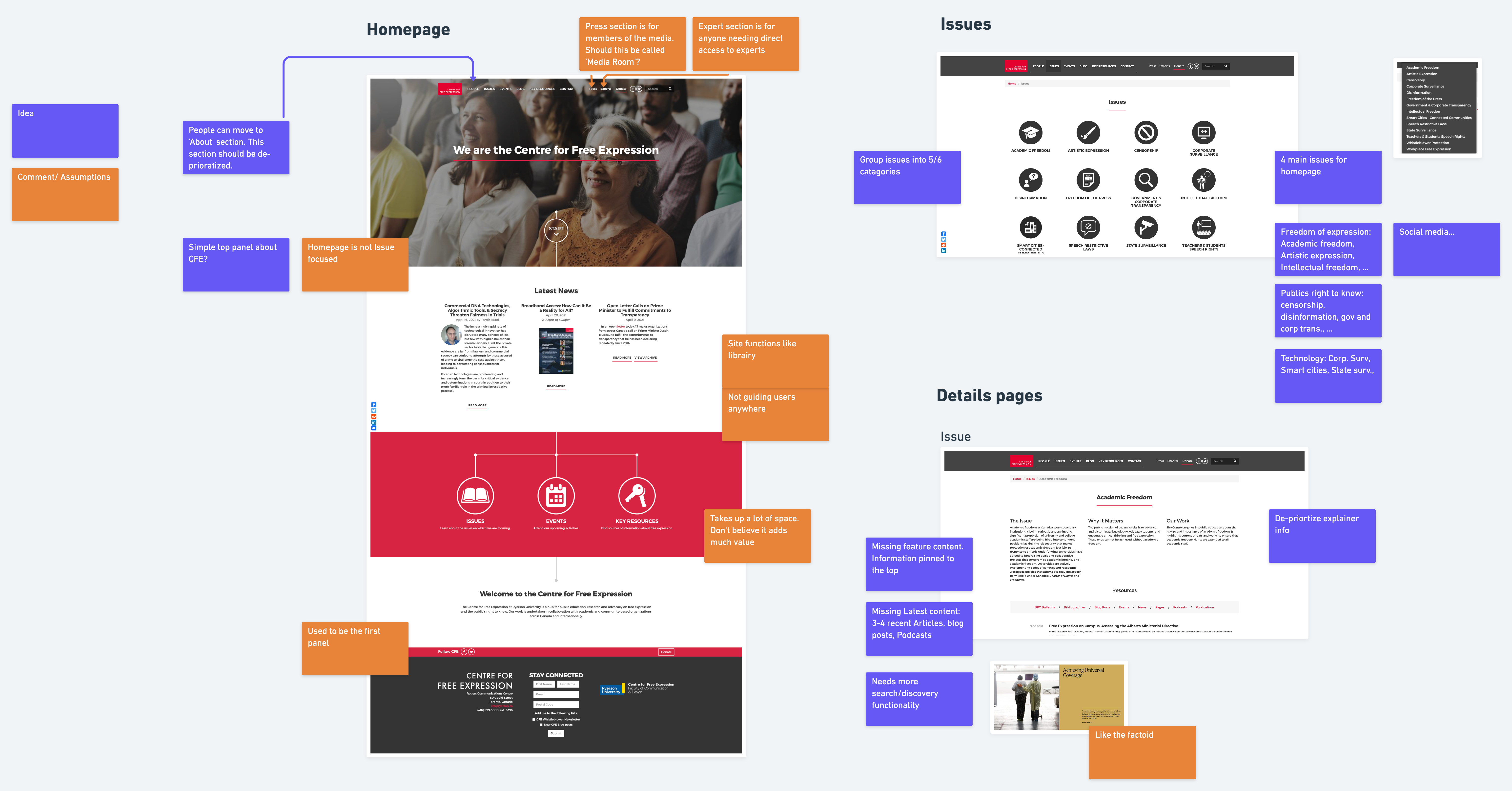
Design Audit of current site
User Research
To balance stakeholder and user needs, I created a user testing script and conducted interviews with five members of the CFE community: bloggers, event attendees, and journalists.
Pain points
- Content is hard to navigate (long breadcrumb trails, redundant web pages)
- Naming conventions are unclear (ie. podcasts, bibliographies)
- Users unaware of important resources on the website (videos, recommended readings)
- Home page → poor, too much scrolling, "not functional more sales-like"
- Issue index page → poor experience, the user expects blog content first
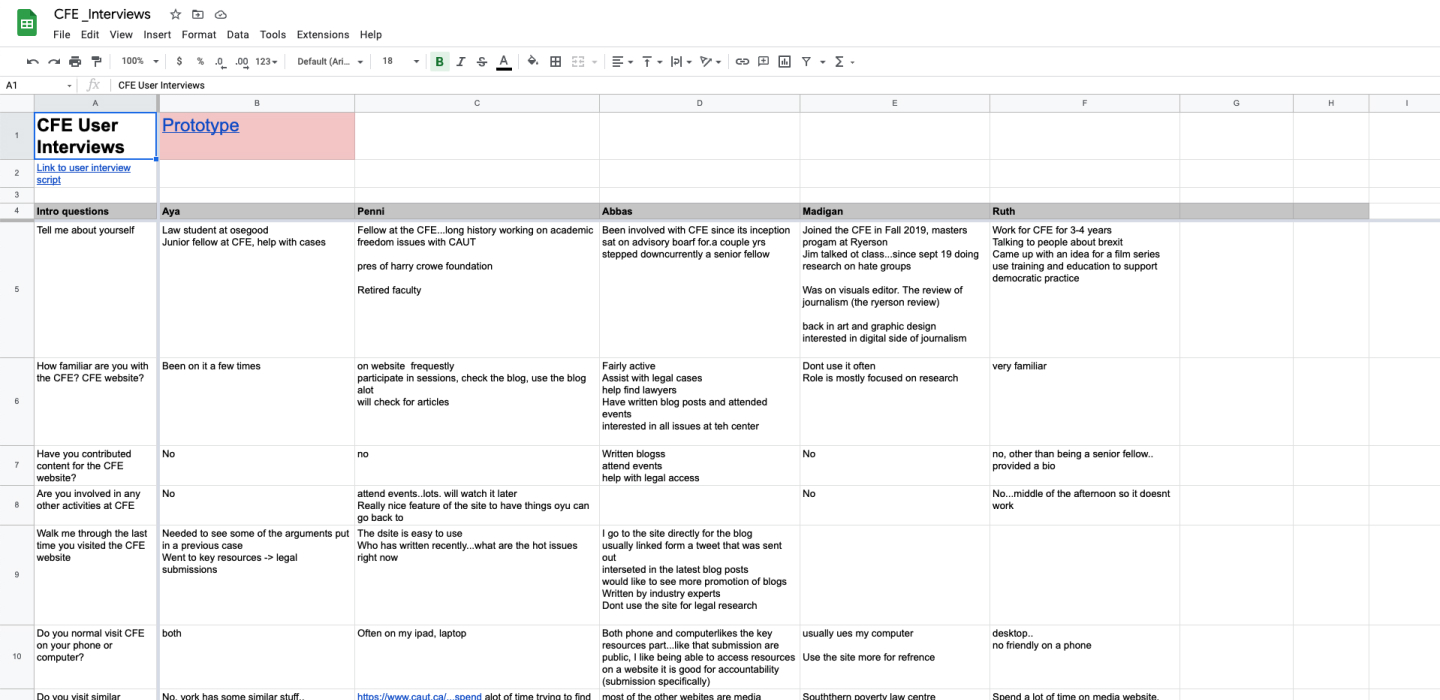
User interview answer sheet
Framing the problem
I synthesized insights from research and stakeholder discussions to clearly define the problem and project scope.
Problem
- Unstructured information architecture made content hard to find.
- Users struggled to navigate and explore key resources.
- The outdated visual design impacted readability and engagement.
Goals
- Make the website resource-focused – Prioritize accessibility to key content.
- Improve information hierarchy – Enhance navigation and content discoverability.
- Update Visual Design
Content analysis
The site needed a simplified way to explore its wealth of resources. Before ideation, we conducted a content audit to assess which resources should be kept, removed, or reorganized for better usability. I led a Content Audit Workshop with stakeholders to go through each type of resource and explore different ways to group it.
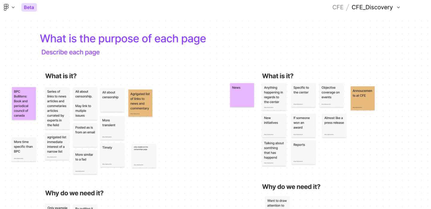
Screen capture from Content Audit workshop
Ideation
User flow + Wireframe
I was curious about how to make the website more content/resource-focused. The original homepage served mainly as a landing page with minimal content visibility. To improve discoverability, I designed a centralized Resource Archive where users could search, filter, and sort CFE's extensive content in one place.
The outcome was a revamped sitemap and a user flow framework to search and explore content.
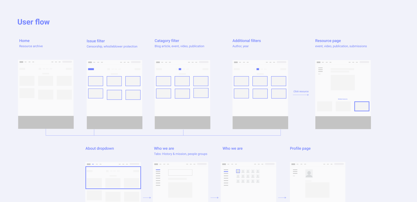
User Flow - How the pages are connected
Wireframe
Lots of ideation work went into designing the Resource page. I explored design patterns that allow users to refine their search/discovery of CFE resources with filters such as Issue Topic, Category and Year. I learned that Issue Topics can be dynamic and therefore using a dropdown component works best to keeps the interface clean and easy to navigate.
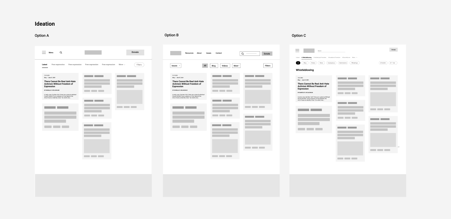
Wireframes - what's on the page and different ways to organize information
Build a Model + Validate Ideas
Test
To get user feedback, I created a simplified grayscale prototype and ran user testing sessions with five CFE community members.
User Feedback
Usability testing confirmed that the redesign significantly improved navigation and usability. Users highlighted the following strengths:
- Cleaner interface
- Improved navigation
- Easy to cross-reference information
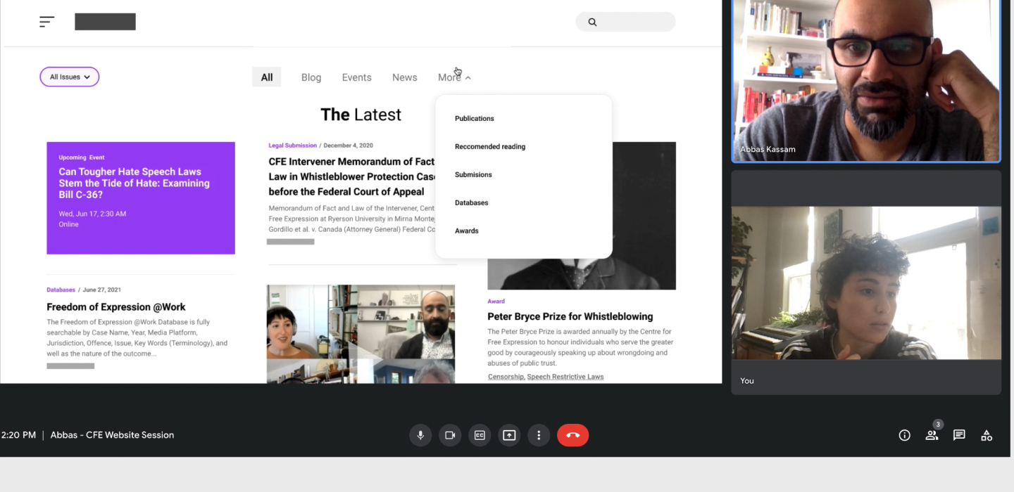
Screenshot from prototype testing session
Final design
- New content structure
- Improved navigation
- Updated visual design
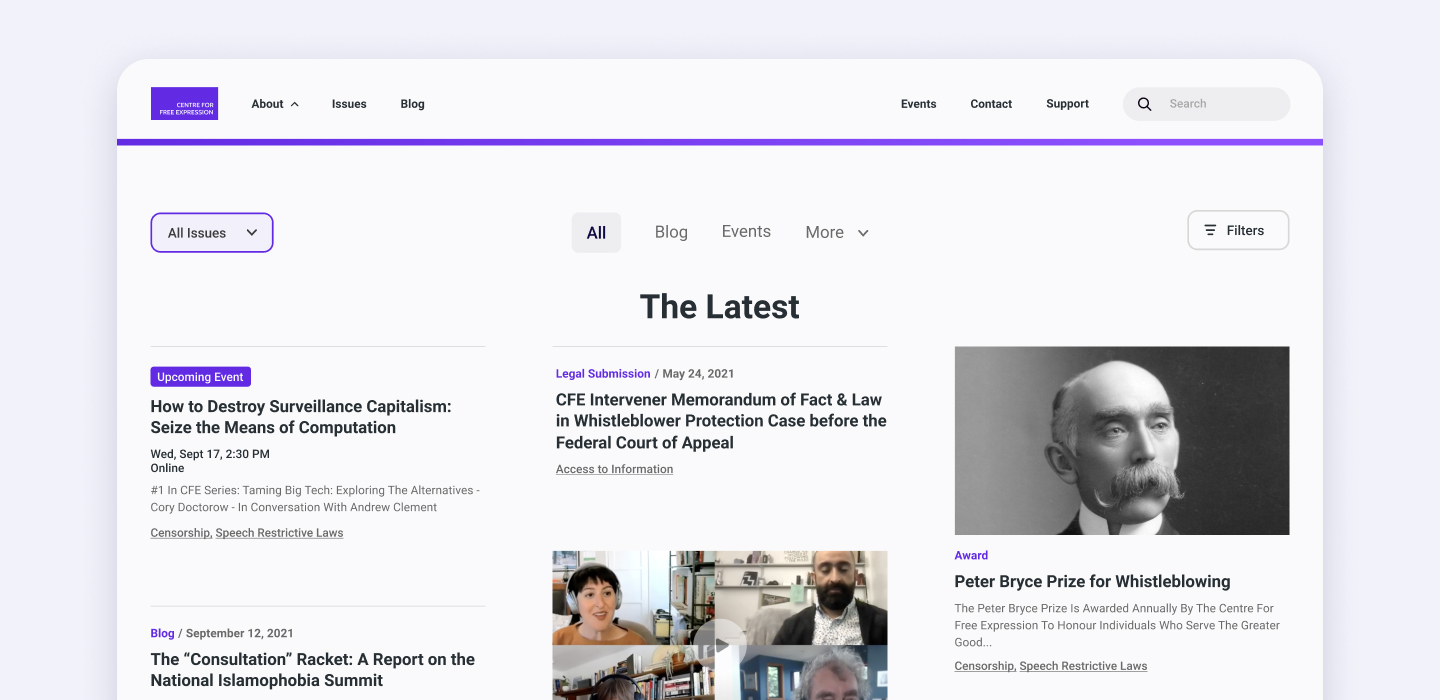
Final design mockup
Before & After
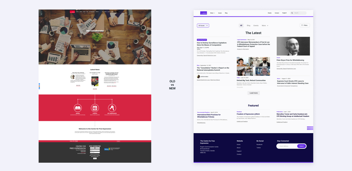
Comparison showing the website before and after the redesign
What are people saying?
"This is much better. You can cross-reference the information and only focus on one issue if I want"
"There is a lot for the reader on the front page... that's really nice!"
"[Event page]Thank you! That has been my one complaint about the site. I want to know what is upcoming and past"