Removing engineering as a bottleneck for configuration
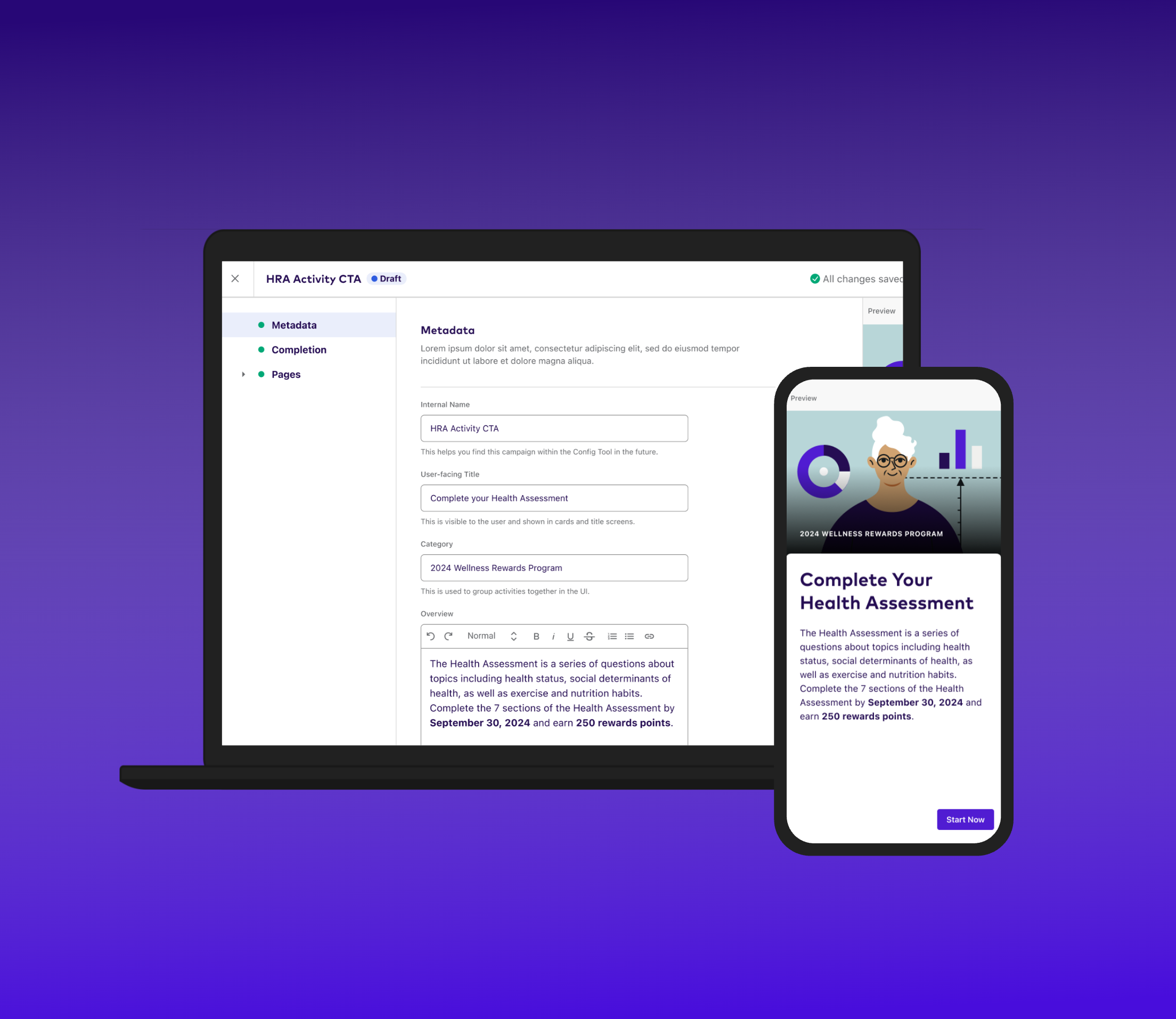
League Console gave non-technical business teams the power to configure rewards activities and program logic themselves — without turning every configuration option into a chance to break production.
Every configuration change went through engineering
Business users who owned League's rewards programs couldn't create or edit a rewards activity without filing a ticket and waiting on engineering. That made engineering a permanent bottleneck for work that had nothing to do with code — and made the business teams dependent on a queue they didn't control.
League Console set out to close that gap: an end-to-end configuration platform that let non-technical teams own their own configuration, without needing engineering in the loop for routine changes.
Configuration power vs. trust in what you're about to publish
The hard part wasn't exposing configuration options — it was exposing enough of them to be genuinely useful, without the interface becoming something a non-technical user was afraid to touch. Give too little control and the tool doesn't solve the original problem. Give too much, unscaffolded, and people either make mistakes in production or stop trusting themselves to use it at all.
"The gap wasn't just capability — it was confidence. People didn't trust themselves to publish something correctly, because nothing showed them what they were about to publish."
Navigation, tested head to head
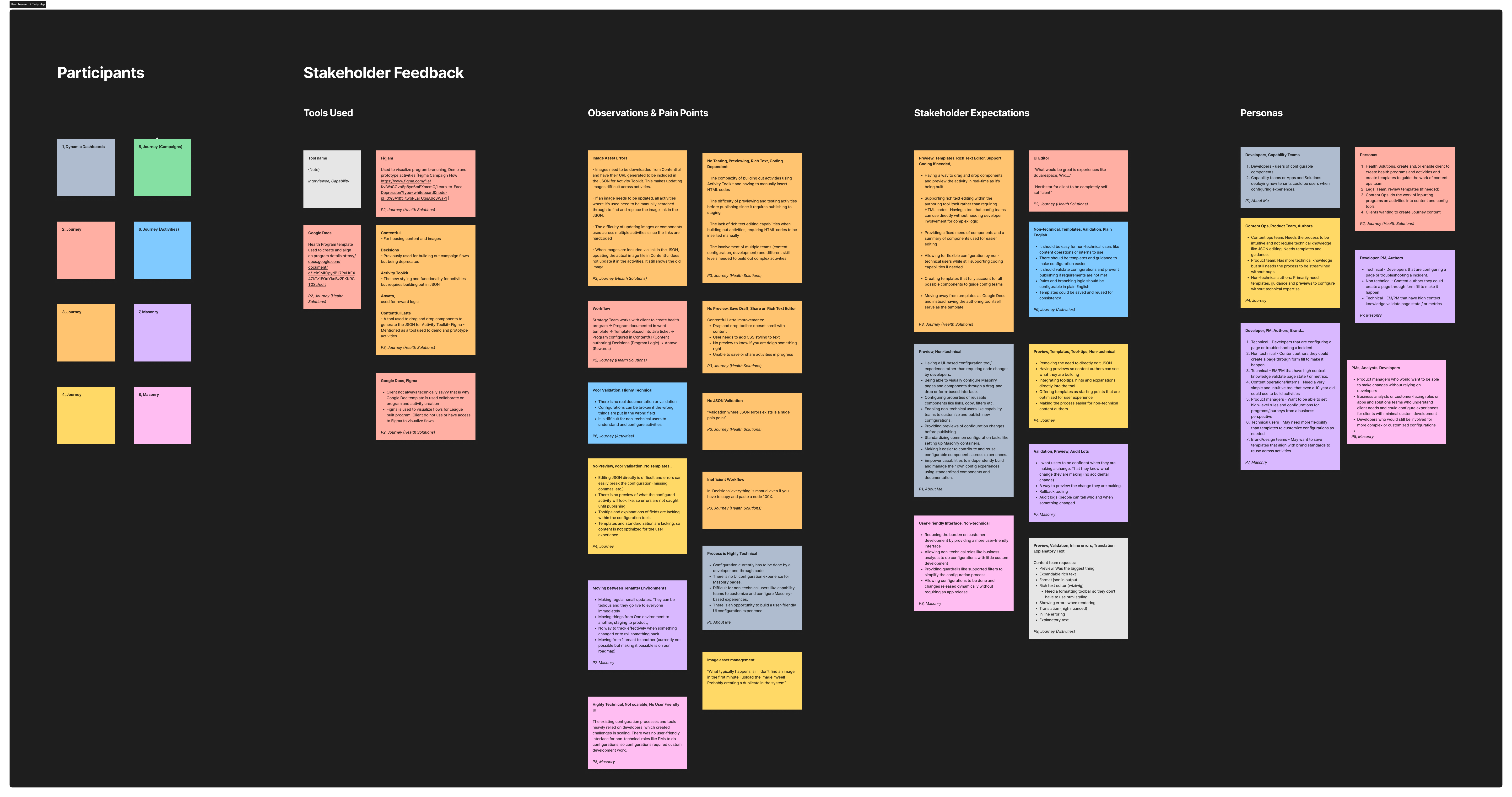
Navigation was where this tension showed up most concretely. I tested two layouts head to head across 9 users from 5 internal teams: a sidebar-based navigation and a card-based one. The sidebar won decisively — 80% of participants preferred it, largely because it kept the full structure of a configuration visible at all times, rather than hiding it behind a card the user had already navigated away from.
The bigger unlock, though, wasn't navigation at all — it was a live preview panel that showed exactly what a change would look like before it published. Live preview and inline helper text did more to build trust in the platform than any amount of added flexibility in the configuration options themselves.
40% faster setup, and a platform teams trusted
League Console shipped with a scalable information architecture, live-preview validation, and the sidebar navigation pattern the research pointed to — reducing admin setup time by 40% in usability testing with internal teams, and removing engineering from the loop for the routine configuration work that used to sit in their queue.
Where to spend design effort
It would have been easy to over-invest in making the power-user paths maximally flexible, since that's where the interesting configuration logic lived. But the research was clear that the highest-leverage work was making the most common path — creating and editing a single rewards activity — feel simple enough that someone would trust it the first time, without help.